Panels
The containers a window is made of: surfaces at three elevations, a titled frame, sections that fold, a strip of slides, placeholders, a labelled number, tabs, and a timeline.
A container holds children and draws a surface around them. None of these
holds a value, so a screen of panels needs no bind= and no Java at all. The
two that keep state, collapse and carousel, keep it themselves and can be
told what it is instead. Every rule below is controls.css’s, and an
application styles the layout around them, not the widgets.
panel
The building block: a flat surface with the theme’s border and radius, and no elevation.
panel class="side" {
  text "The map"
  text "Where the road goes next."
}
new Panel(
        new Text("The map"),
        new Text("Where the road goes next.")
).styled("side");
Attributes
| Attribute | Type | Default | What it does |
|---|---|---|---|
id, class | string | The usual. Any children. |
Styling
The CSS type is panel: a column, --gb-surface, a 1px --gb-border, radius
8. No parts, no pseudo-classes, no variants. It is the one container a theme
can restyle completely.
Read more
card
A raised surface: a shadow and a stronger edge, level 1 of the design system’s ladder, lifting to level 2 under the pointer when asked.
card class="interactive" {
  text class="card-title" "Surfaces"
  text "Point at it and the shadow rises."
}
new Card(
        new Text("Surfaces").styled("card-title"),
        new Text("Point at it and the shadow rises.")
).styled("interactive");
The edge stays even though there is a shadow, because a card on another card
casts onto the same colour and only the rim tells them apart
(ADR-0166). The
shadow is --gb-elevation-1, which each theme ships
(ADR-0310).
Attributes
| Attribute | Type | Default | What it does |
|---|---|---|---|
id, class | string | The usual. Any children. |
Styling
The CSS type is card: --gb-surface-raised, a 1px --gb-border-strong,
radius 8, padding 12, gap 8. The variant class interactive adds a hover
elevation: card.interactive:hover takes the accent edge and
--gb-elevation-2, with the blur, offset and alpha moving together
(ADR-0312). It is
opt-in, because a card that lit up would promise it does something.
Read more
- ADR-0164: Elevation is an edge and a closed section is absent
- ADR-0310: A shadow is a stack of rectangles
group-box
A titled frame for a cluster of settings. The frame goes round both the title and the content.
group-box title="The Company" {
  row { text "Ring-bearer"; spacer; text class="caption" "Frodo Baggins" }
  row { text "Guide"; spacer; text class="caption" "Gandalf the Grey" }
}
new GroupBox("The Company",
        new Row(new Text("Ring-bearer"), new Spacer(), new Text("Frodo Baggins").styled("caption")),
        new Row(new Text("Guide"), new Spacer(), new Text("Gandalf the Grey").styled("caption")));
Attributes
| Attribute | Type | Default | What it does |
|---|---|---|---|
title | string | none | The header row. Without it there is no header and no gap where one would be. |
id, class | string | The usual. Any children. |
The title is a property and not the argument, because the argument position is
where a container’s children start and group-box "Appearance" { … } would
read as content.
Styling
The CSS type is group-box. Its parts are group-box-title, a tinted header
ruled off from the body with --gb-surface-2 and --gb-font-heading, and
group-box-body. The title part is absent when there is no title. A legend
cut through the border is not available
(ADR-0166).
collapse
A header and a body that folds away. The body is unmounted while closed, not hidden, so a shut section holds no subscriptions for content nobody can see.
collapse title="The Council's terms" open=#true {
  row { text "Bearers"; spacer; text class="caption" "1" }
  row { text "Companions"; spacer; text class="caption" "8" }
}
new Collapse("The Council's terms",
        new Row(new Text("Bearers"), new Spacer(), new Text("1").styled("caption")),
        new Row(new Text("Companions"), new Spacer(), new Text("8").styled("caption")));
A collapse keeps whether it is open. Name a toggle action and it stops
keeping it: the header then raises "true" or "false" and the section is as
open as open says. The Java form is
new Collapse(title, open, onToggle, children...).
An accordion is a column. column accordion=#true inflates to an
Accordion that re-issues each collapse child so only one is open at a time
(ADR-0166). A
section the application already controls is left alone, and from markup an
accordion starts with every section shut.
column accordion=#true {
  collapse title="The Shire" { text "Second breakfast kept." }
  collapse title="Rivendell" { text "Council held." }
  collapse title="Moria" { text "Doors: Mellon." }
}
new Accordion(
        new Collapse("The Shire", new Text("Second breakfast kept.")),
        new Collapse("Rivendell", new Text("Council held.")),
        new Collapse("Moria", new Text("Doors: Mellon."))
);
Attributes
| Attribute | Type | Default | What it does |
|---|---|---|---|
title | string | "" | The header’s text. |
open | boolean | #false | The initial state, or the state itself once toggle is named. |
toggle | action name | none | Called with "true" or "false" when the header is pressed. Naming it makes the section controlled. |
id, class | string | The usual. The children are the body. |
Styling
The CSS type is collapse, with the class open while it is. Its parts are
collapse-header, which matches :hover, :focus-visible and :checked
while open, collapse-chevron, which rotates 90° through .open, and
collapse-body. The header is 40px, 36 at compact density. The body does not
animate, because height is not on the motion whitelist and the body is not
there while closed.
Keyboard
The header is the one Tab stop.
| Key | Does |
|---|---|
Enter, Space | toggles |
Right | opens |
Left | closes |
Read more
- ADR-0164: Elevation is an edge and a closed section is absent
- ADR-0166: A raised thing is told apart by its edge
carousel
One slide visible out of a list, with previous and next and a dot per slide. Only the current slide exists; the others are dropped when you leave them.
carousel loop=#true interval=5000 {
  panel class="slide" { text "Stage 1 of 3: Bag End" }
  panel class="slide" { text "Stage 2 of 3: Rivendell" }
  panel class="slide" { text "Stage 3 of 3: Moria" }
}
var slides = List.of(
        new Panel(new Text("Stage 1 of 3: Bag End")).styled("slide"),
        new Panel(new Text("Stage 2 of 3: Rivendell")).styled("slide"),
        new Panel(new Text("Stage 3 of 3: Moria")).styled("slide")
);
new Carousel(0, null, true, Duration.ofSeconds(5), slides, Attributes.NONE);
new Carousel(Widget... slides) is the short form: no loop, no rotation. Name
a change action and the carousel becomes controlled, showing the slide
index names and raising the index it would like next.
Nothing advances on its own unless interval is set. When it is, rotation
has three brakes: it pauses while the pointer is over the strip, while the
keyboard is anywhere inside it, and entirely under reduced motion
(ADR-0165,
ADR-0169). Without
loop it also stops at the last slide.
Attributes
| Attribute | Type | Default | What it does |
|---|---|---|---|
index | number | 0 | The slide shown, clamped into range. |
loop | boolean | #false | Whether next on the last slide goes to the first. |
interval | number, ms | 0 | How often to advance on its own. 0 is never. |
change | action name | none | Called with the wanted index. Naming it makes the carousel controlled. |
id, class | string | The usual. Each child is one slide. |
Styling
The CSS type is carousel, with the class rotating while an interval runs.
Its parts are carousel-viewport, carousel-controls holding two
carousel-step buttons with the classes previous and next, and
carousel-dots of carousel-dot, shown only with more than one slide. A step
matches :hover, :active, :focus-visible and :disabled at an end of a
non-looping strip. The current dot matches :checked. The steps are
button.ghost.circle’s shape, the dots 8px.
Keyboard
The strip is one Tab stop when it has two or more slides.
| Key | Does |
|---|---|
Left, Right | previous and next slide |
Home, End | the first and last slide |
Enter, Space | on a focused step button, presses it |
Read more
skeleton
The placeholder a widget shows while its data loads, sized from the typography token it stands in for so the layout does not jump when the content arrives.
row {
  skeleton shape="circle"
  column {
    skeleton shape="title"
    skeleton shape="text" lines=2
  }
}
new Row(
        new Skeleton(Skeleton.Shape.CIRCLE),
        new Column(
                new Skeleton(Skeleton.Shape.TITLE),
                new Skeleton(Skeleton.Shape.TEXT, 2, Attributes.NONE)
        )
);
A shimmer is a loop, and the design system allows one decoration to loop. It is an opacity pulse between 0.45 and 1.0 over a second, held at its dimmest under reduced motion.
Attributes
| Attribute | Type | Default | What it does |
|---|---|---|---|
shape | "text", "title", "circle", "rect" | "text" | What it stands in for. Any other word is refused. |
lines | number | 3 | How many bars a text skeleton draws. Fewer than one is refused. |
id, class | string | The usual. Children are ignored. |
new Skeleton() is three lines of text.
Styling
The CSS type is skeleton, and both it and each skeleton-bar carry the class
shape-text, shape-title, shape-circle or shape-rect
(ADR-0414).
The last bar of a multi-line text skeleton also carries last and is 60%
wide. Radius 4, or full for a circle.
Read more
statistic
A labelled number: a value in the display size, a caption over it, and an optional unit, delta and sparkline.
row {
  statistic label="Leagues walked" value="1,795" delta="+42" direction="up"
  statistic label="Days from Rivendell" value="93" unit="d" delta="-2" direction="down"
  statistic label="Companions lost" value="1" delta="Gandalf"
}
new Row(
        new Statistic("Leagues walked", "1,795").delta("+42", Statistic.Direction.UP),
        new Statistic("Days from Rivendell", "93").unit("d").delta("-2", Statistic.Direction.DOWN),
        new Statistic("Companions lost", "1").delta("Gandalf", Statistic.Direction.NONE)
);
The value is a string. Formatting is the application’s, because a number formatted inside the toolkit makes a golden image that depends on the machine’s locale.
Attributes
| Attribute | Type | Default | What it does |
|---|---|---|---|
label | string | required | The caption. |
value | string | required | The number, as text. |
unit | string | none | Drawn after the value, smaller. |
delta | string | none | A change, drawn under the value. |
direction | "up", "down", "none" | "none" | Colours the delta --gb-success or --gb-danger. |
id, class | string | The usual. Children are ignored. |
A sparkline is Java only: .sparkline(Sparkline) takes the
sparkline widget and draws it 64×24 under the number
(ADR-0193).
Styling
The CSS type is statistic. Its parts are statistic-label,
statistic-value holding statistic-unit, and statistic-delta, which
carries the class up or down.
tabs
A strip of headers over one panel: pick a tab and its content is built, leave it and the content is dropped, unless the strip is told to keep it.
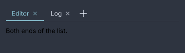
Closable tabs and a new button.
tabs value="map" change="app.pick-tab" close="app.close-tab" new="app.new-tab" {
  tab value="map" "The map" {
    text "Where the road goes."
  }
  tab value="road" icon="footprints" closable=#true "The road" {
    text "How far it is."
  }
  tab value="moria" colour="#bf616a" "Moria" {
    text "Avoid."
  }
}
new Tabs("map",
        new Tab("map", "The map", new Text("Where the road goes.")),
        new Tab("road", "The road", new Text("How far it is.")).icon(footprints).closable(true),
        new Tab("moria", "Moria", new Text("Avoid.")).colour(0xFFBF616A))
    .onChange(actions::pickTab)
    .onClose(actions::closeTab)
    .onNew(actions::newTab);
The strip is a model, a header and a panel
(ADR-0107).
Which tab is selected is value, or the bound value, and the strip reports
what the user wants through change, close and new. Adding and removing
tabs needs no API: rebuild with a different list. A header row too wide for
the strip pages from its ends
(ADR-0365).
keep-alive hides a left tab’s content instead of dropping it, for an editor
whose state is costly to rebuild
(ADR-0366). Reordering by
drag is Java only, through onReorder(BiConsumer<String, Integer>)
(ADR-0372).
Attributes
| Attribute | Type | Default | What it does |
|---|---|---|---|
value | string | none | The selected tab’s value, when nothing is bound. |
bind | path | none | A value to read the selection from instead. |
change | action name | none | Called with the value of the tab the user picked. |
close | action name | none | Called with the value of the tab whose × was pressed. |
new | action name | none | Adds a + button after the tabs and calls this when it is pressed. |
keep-alive | boolean | #false | Keeps a left tab’s content mounted and hidden. |
id, class | string | The usual. |
new Tabs(String value, Widget... tabs) is the Java form, with onChange,
onClose, onNew, keepAlive, onReorder and bound after it. Children
that are not tabs are placed in the header row.
Styling
The CSS type is tabs. The header is a tab-list holding a tab-rule, a
scroll.tab-viewport of tabs, and while they overflow a tab-pager at each
end with the class start or end. Each tab matches :hover, :checked
and :focus-visible, and holds a tab-indicator that matches :checked and
travels between tabs, a tab-close on a closable one, and the strip ends in
tab-new when new is wired. The content is tab-panel, and under
keep-alive each kept tab is a tab-page. A tab is 36px with a 2px accent
indicator.
Keyboard
The strip is one Tab stop.
| Key | Does |
|---|---|
Left, Right | move between the tab headers and the + button, without selecting |
Enter, Space | select the focused tab, or press + |
Delete | closes the focused tab, when it is closable |
Tab | leaves the strip for its content |
Read more
- ADR-0107: A tab strip is a model, a header and a panel
- ADR-0109: A tab arrives and departs on the frame clock
- ADR-0365: An overflowing tab strip pages from its ends
- ADR-0366: A kept tab is hidden, not removed
- ADR-0377: An underline travels by being let go of
tab
One tab: the value its strip reports, a label, and the content shown while it is selected.
tab value="road" icon="footprints" colour="#bf616a" closable=#true "The road" {
  text "How far it is."
}
new Tab("road", "The road", new Text("How far it is."))
        .icon(footprints)
        .colour(0xFFBF616A)
        .closable(true);
Attributes
| Attribute | Type | Default | What it does |
|---|---|---|---|
value | string | required | What the strip matches on and reports. Missing is refused. |
| argument | string | "" | The label. A tab with neither a label nor an icon is refused. |
icon | icon name | none | An icon before the label. |
colour, color | CSS colour | the theme’s | The indicator’s colour, written as a stylesheet writes one. |
closable | boolean | #false | Adds a × and lets Delete close it. |
id, class | string | The usual. The children are the content. |
Warning
Two tabs with the same
valueare one tab: the later replaces the earlier one’s content and nothing reports it.
timeline
An ordered list of entries along an axis, each with a marker, a label, an optional time and optional body.
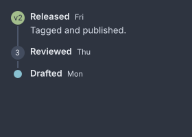
Entries with a dot, a number and a badge for a marker.
timeline pending=#true {
  entry time="Mon" "Drafted"
  entry time="Thu" "Reviewed" {
    marker { badge "3" }
  }
  entry time="Fri" icon="tag" "Released" {
    text "Tagged and published."
  }
}
new Timeline(
        new Entry("Drafted").at("Mon"),
        new Entry("Reviewed").at("Thu").withMarker(new Badge("3")),
        new Entry("Released", new Text("Tagged and published.")).at("Fri").withIcon(tag)
).pending(true);
The line goes on: pending draws a trailing unfilled marker after the last
entry for what happens next, which is what tells a timeline from a list with
dots (ADR-0345).
Attributes
| Attribute | Type | Default | What it does |
|---|---|---|---|
direction | "vertical", "horizontal" | "vertical" | Which way the axis runs. |
align | "start", "alternate" | "start" | Every entry on one side, or alternating sides. |
pending | boolean | #false | A trailing empty marker. |
id, class | string | The usual. entry children sit on the axis, anything else passes through. |
An unknown direction or align falls back to the default without complaint.
Styling
The CSS type is timeline, with the classes horizontal and alternate. Each
entry carries end on the alternate side and pending on the trailing
marker. An entry is a timeline-rail, holding a timeline-marker-cell with
the timeline-marker and a timeline-line, beside a timeline-side holding
timeline-body, timeline-head, timeline-label, timeline-time and
timeline-content. The marker carries icon, widget or pending. Marker
12px, axis 2px in --gb-border, rail 20 wide.
Read more
- ADR-0345: A timeline is a list whose line goes on
- ADR-0356: A connector grows from where you were, and an entry has a marker slot
entry
One event: a label, an optional time, and a marker that is a dot, an icon, or any widget.
entry time="Thu" icon="tag" colour="#a3be8c" "Reviewed" {
  text "Two approvals."
}
new Entry("Reviewed", new Text("Two approvals."))
        .at("Thu")
        .withIcon(tag)
        .colour(0xFFA3BE8C);
Attributes
| Attribute | Type | Default | What it does |
|---|---|---|---|
| argument | string | required | The label. |
time | string | none | The timestamp after the label, in caption. |
icon | icon name | none | Drawn in a 20px disc as the marker. |
colour, color | CSS colour | the theme’s | The marker’s colour. |
id, class | string | The usual. One marker child is the marker; every other child is the body. |
Two marker children are refused.
marker
The thing drawn on the axis instead of a dot: exactly one widget.
marker { badge "v2" }
new EntryMarker(new Badge("v2"));
It takes exactly one child and no attributes of its own. The child is drawn
under timeline-marker.widget. In Java, Entry.withMarker(Widget) is the
usual route.