Fields and forms
A field owns its caret and tells the model, and a form is found by its fields.
By the end of this chapter you can put a text field on screen, bind it, filter
what it accepts, wrap it in a labelled field with a validator, submit a
form from a button, and take a date, a time, a colour or a one-time code.
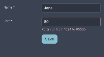
A form.horizontal with one invalid field. The message is in the field's own column, under the control.
How a field talks to the model
A field holds its own text, caret, selection and undo stack. None of those are
things a model can hold, so bind= is the initial text and an override, and
change= reports each new value. The field ignores the echo of its own
keystroke rather than resetting the caret on every letter
(ADR-0167).
An input method composes inline. The composition is drawn underlined at the
caret with its converting clause highlighted, held beside the value rather than
in it, so change= fires once for the accepted candidate and not once per
keystroke. A password refuses to compose, because a candidate window is a
second, unmasked window showing what is being typed. Committed text still
arrives (ADR-0292).
Right-to-left editing is not built. A paragraph approximates bidirectional text rather than refusing it (ADR-0218).
text-input
A text-input is a single line of text in a well.
column {
  text-input bind="app.name" change="app.set-name" placeholder="Your name" max-length=40
  text-input bind="app.port" change="app.set-port" filter="digits" max-length=5
  text-input password=#true placeholder="The word that opens the doors"
  text-input value="Copied from the Red Book" read-only=#true
  text-input value="Speak, friend" disabled=#true
}
import dev.goldberry.widgets.form.textinput.TextInput;
import dev.goldberry.widgets.form.textinput.TextFilter;

new Column(
        TextInput.of(Models.observable(app, "app.name"), actions::setName)
            .placeholder("Your name")
            .maxLength(40),
        TextInput.of(Models.observable(app, "app.port"), actions::setPort)
            .filter(TextFilter.DIGITS)
            .maxLength(5),
        new TextInput().password(true).placeholder("The word that opens the doors"),
        new TextInput("Copied from the Red Book", null).readOnly(true),
        new TextInput("Speak, friend", null).disabled(true)
);
A filter rejects and never corrects: a keystroke or a paste the filter refuses
leaves the field as it was. A paste past max-length is clipped, not refused.
A read-only field has a caret and a selection and takes no edit. A disabled one
is out of the Tab order.
Suggestions under a field are TextInput.suggesting(options) in Java. The
field reports what was typed through change, is rebuilt with a list, and
reports a chosen suggestion through the same change. In markup,
suggestions= names a bound List<Option> the answer lands in
(ADR-0367).
Attributes
| Attribute | Type | Default | What it does |
|---|---|---|---|
value | string | "" | the written text |
bind | path | none | the text to follow; the initial value and an override |
change | action name | none | told the whole value after every edit |
placeholder | string | "" | shown while empty, in --gb-text-placeholder |
max-length | integer | unlimited | characters; 0 or less means no limit |
password | boolean | #false | masks the text, refuses copy and cut, composes nothing |
read-only | boolean | #false | a caret and a selection, no edits |
filter | none, digits, integer, alnum | none | what the field accepts; an unknown name is logged and the field accepts anything |
suggestions | path | none | a bound List<Option> shown under the field |
disabled | boolean | #false | out of the Tab order |
class, id, tooltip, context-menu, name | as on every widget |
alphanumeric is accepted as a spelling of alnum.
Styling
- CSS type
text-input. - Parts:
text-value, which takes the classplaceholderwhile empty;text-caret;text-selection;text-composition, the rule under an open composition. - Pseudo-classes:
:hover,:focus-visible,:disabled. Inside afield,field:invalid text-inputdraws the danger border.
Height 32, padding 8, radius 4, in body. The fill is --gb-surface-sunken,
an alpha, so a field is one step below the page, a panel or a card alike
(ADR-0168). The
caret and the selection are one line tall, and the caret is
--gb-caret-width wide
(ADR-0253).
text-align places the value in the field and the caret with it
(ADR-0324).
Keyboard
One key map serves text-input, text-area and the canvas Editor
(ADR-0376).
| Key | Does |
|---|---|
Left, Right | move the caret |
Ctrl+Left, Ctrl+Right | move by word; in a password, to the start or the end |
Home, End | the start and the end of the line |
Shift with any of these | extends the selection |
Ctrl+A | selects all |
Backspace, Delete | delete one character; with Ctrl, a word |
Ctrl+Z, Ctrl+Shift+Z, Ctrl+Y | undo and redo; a typing run is one step |
Ctrl+X, Ctrl+C, Ctrl+V | cut, copy and paste; a password refuses the first two |
Tab | moves focus; the field does not consume it |
The accelerators are on the platform’s modifier, so they are Cmd on macOS
and Ctrl elsewhere. Word movement stays on Ctrl everywhere.
A click places the caret and a drag is a selection. Where the platform has a primary selection, a finished selection is published and a middle click pastes it at the pointer (ADR-0504).
Read more
- ADR-0167: a field owns its caret and the model is told
- ADR-0168: a field is a well and a drag is a selection
- ADR-0292: a field composes and a password does not
- ADR-0376: one key map, three editors
- ADR-0412: a field shows its beginning
- ADR-0504: a selection is published where the platform has a primary selection
text-area
A text-area is text-input with a second dimension: soft wrap, a height that
grows between two row counts, and a scrollbar past the second.
column {
  text-area bind="app.bio" change="app.set-bio" rows=3 max-rows=6 placeholder="A few lines"
  text-area class="mono" gutter=#true rows=8 max-rows=8 bind="app.notes" change="app.set-notes"
  text-area fill=#true bind="doc.source" change="doc.set-source"
}
import dev.goldberry.widgets.form.textarea.TextArea;

new Column(
        TextArea.of(Models.observable(app, "app.bio"), actions::setBio)
            .rows(3, 6)
            .placeholder("A few lines"),
        TextArea.of(Models.observable(app, "app.notes"), actions::setNotes)
            .rows(8, 8)
            .gutter(true)
            .styled("mono"),
        TextArea.of(Models.observable(doc, "doc.source"), actions::setSource)
            .fill(true)
            .onEdit(actions::remember)
            .edit(pending)
);
gutter=#true numbers the lines you typed, at the positions the wrap put
them. A paragraph that soft-wraps into three lines takes one number and three
lines’ height, which is why a column of numbers built beside the control does
not work (ADR-0331).
fill=#true makes it an editor rather than a field: it takes the height
its container gives it and scrolls inside that.
onEdit and edit are Java only and are the seam a shortcut needs.
change= says what the text is now and nothing about where. onEdit is told
a TextEdit of text, anchor and caret after every change, caret moves
included, and edit(TextEdit) offers an edit the application computed, caret
and all (ADR-0332). A
TextEdit is not a value a document can write.
Attributes
| Attribute | Type | Default | What it does |
|---|---|---|---|
value | string | "" | the written text |
bind | path | none | the text to follow |
change | action name | none | told the whole value after every edit |
placeholder | string | "" | shown while empty |
rows | integer | 3 | the height to start at, in lines; at least 1 |
max-rows | integer | 10, or rows if larger | the height to grow to before scrolling |
max-length | integer | unlimited | characters |
fill | boolean | #false | take the container’s height and scroll inside it |
gutter | boolean | #false | number the hard lines down the left edge |
read-only | boolean | #false | a caret and a selection, no edits |
disabled | boolean | #false | out of the Tab order |
class, id, tooltip, context-menu, name | as on every widget |
Styling
- CSS type
text-area. - Parts:
text-input’s four, one highlight and one composition rule per visual line, andtext-area-gutter, the strip of numbers. - Pseudo-classes:
:hover,:focus-visible,:disabled.
Minimum height 64, padding 8, radius 4. The gutter’s ink is
--gb-gutter-color and its room is --gb-gutter-gap, and the column is
measured in whatever font the node resolved, which is why the showcase gives a
gutter class="mono". Past max-rows it draws scroll’s overlay bar over its
own offset (ADR-0362).
The height is the widget’s and not the stylesheet’s, because it is a function of how many lines the text wrapped into.
Keyboard
text-input’s map, and:
| Key | Does |
|---|---|
Enter | breaks a line |
Up, Down | move a line, keeping the column |
Home, End | the start and the end of the visual line |
Ctrl+Home, Ctrl+End | the start and the end of the text |
| wheel | three lines of this control’s own text per notch |
Read more
- ADR-0171: a column is an x, and a width arrives late
- ADR-0331: a gutter numbers hard lines at soft positions
- ADR-0332: an editor is handed the caret
- ADR-0362: a text-area draws scroll’s bar
- ADR-0388: a note is shaped a line at a time
field
A field is a label, a control, and a message slot under it, with a validator
over the control’s value.
form class="horizontal" {
  field label="Name" required=#true {
    text-input bind="signup.name" change="signup.set-name" placeholder="Meriadoc Brandybuck"
  }
  field label="Port" required=#true validator="signup.port-rule" {
    text-input bind="signup.port" change="signup.set-port" filter="digits" max-length=5
  }
  field class="actions" {
    button class="primary" press="signup.submit" "Enlist"
  }
}
import dev.goldberry.widgets.form.field.Field;
import dev.goldberry.widgets.form.form.Form;
import dev.goldberry.widgets.form.Validator;

new Form(
        new Field("Name",
                TextInput.of(Models.observable(signup, "signup.name"), actions::setName))
            .required(true),
        new Field("Port",
                TextInput.of(Models.observable(signup, "signup.port"), actions::setPort)
                    .filter(TextFilter.DIGITS))
            .required(true)
            .validate(Validator.parsing(Integer::parseInt, "A port is a number")),
        new Field("", new Button("Enlist", actions::submit).styled("primary"))
            .styled("actions")
).styled("horizontal");
The validation model
A field is silent until you leave it once, and live from then on. It says nothing while the user is still in it, however wrong the value is. Once it has complained, it re-checks on every change so the message goes the instant the value is fixed. Submitting is the third moment, and the only one that makes an unvisited field speak (ADR-0169).
A validator returns a message, not a boolean, because a field that goes red
without saying why is one somebody has to guess at. required=#true is
Validator.required("This field is required") in front of whatever
validator= names, and and reports the first failure because the message
slot is one line. Validator.of(predicate, message), minLength, matching
and parsing are the built-in rules.
The field reads its value from the control’s own bind=. It walks its
children one level, so a hint under the control is not what gets validated.
A click on the label focuses the control (ADR-0170).
Attributes
| Attribute | Type | Default | What it does |
|---|---|---|---|
label | string | "" | the label beside or above the control |
required | boolean | #false | an asterisk on the label and a rule that refuses blank |
validator | object name | none | a Validator<String> the application registered under this name |
class, id, tooltip, context-menu, name | as on every widget |
The children are the controls. A validator= name resolves in the Named
registry, the fourth registry beside actions, icons and bindings. An
application builds one with Named.strict().bind("signup.port-rule", rule)
and hands it to Widgets.inflater(named, icons, models…).
Styling
- CSS type
field. - Parts:
field-label, which takes the classrequired;field-body, the column holding the control and the message;field-message, in--gb-danger-text. - Pseudo-classes:
:invalid, whichfield:invalid text-inputandfield:invalid selectuse for the danger border. - Classes:
horizontalputs the label in a column beside the body;verticaltakes it back inside aform.horizontal;actionsis a field with no label whose body lines up with the controls.
Stacked is the default. The label column’s width is --gb-field-label-width,
one token, so an application moves every form at once. A field is two boxes
because the subset has no grid: a label beside a body is a row, and a message
under a control is a column
(ADR-0169).
Keyboard
None of its own. The controls inside it have theirs.
Read more
- ADR-0169: a field is silent until you leave it
- ADR-0170: a document names an object, and a label hands focus down
- ADR-0229: a hue has a rank for words as well as for lines
form
A form finds the fields in its subtree and gates a submission on their
validity.
form controller="signup.form" submit="signup.enlist" {
  field label="Name" required=#true { text-input placeholder="Peregrin Took" }
  field label="Port" { text-input placeholder="8080" filter="digits" }
}
import dev.goldberry.widgets.form.form.FormController;

var controller = new FormController();

new Form(
        new Field("Name", new TextInput().placeholder("Peregrin Took")).required(true),
        new Field("Port", new TextInput().placeholder("8080").filter(TextFilter.DIGITS))
).controller(controller)
    .onSubmit(actions::enlist);

controller.submit();      // validates every field, runs onSubmit when all pass
controller.isValid();
controller.errors();      // every field's message, in order
controller.reset();       // clears every message
A FormController is what submits, because a Save button is usually outside
the form. submit() makes every field check, returns whether all passed, and
runs submit= when they did. submit carries nothing: bind= reads from the
application’s model, so an event carrying the bound values would hand an
application its own data back
(ADR-0169).
The fields are anywhere in the subtree: inside rows, inside cards, inside a
collapse.
Attributes
| Attribute | Type | Default | What it does |
|---|---|---|---|
controller | object name | none | a FormController the application registered under this name |
submit | action name | none | run when a submission passes |
class, id, tooltip, context-menu, name | as on every widget |
Styling
- CSS type
form. - No parts.
- No pseudo-classes.
- Classes:
horizontalgives every field in it a label column;form.horizontal field.verticaltakes one field back.
Keyboard
None. Enter in a field does not submit. A button’s action calls
FormController.submit().
Read more
- ADR-0169: a field is silent until you leave it
- ADR-0170: a document names an object, and a label hands focus down
code-input
A code-input is the one-time-code field: a row of single-character boxes
over one string.
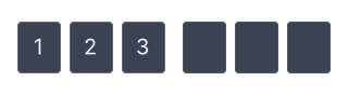
A code-input of six. The wider gap at the midpoint exists only when the length is even.
column {
  code-input length=6 type="digits" bind="app.code" change="app.set-code" complete="app.code-complete"
  code-input length=6 mask=#true
  code-input length=5 type="alnum"
}
import dev.goldberry.widgets.form.codeinput.CodeInput;
import dev.goldberry.widgets.form.codeinput.CodeType;

new Column(
        CodeInput.of(Models.observable(app, "app.code"), actions::setCode)
            .length(6)
            .onComplete(actions::codeComplete),
        new CodeInput(6, null).mask(true),
        new CodeInput(5, null).type(CodeType.ALNUM)
);
The value is a string and the boxes are a drawing. There is no caret and no
per-box array: the active box is the first empty one, derived on every frame.
Typing appends, a paste of 123 456 drops the spaces and fills every box at
once, and complete fires on the edit that filled the last box
(ADR-0273).
A character the type refuses is dropped rather than rejecting the whole paste.
Attributes
| Attribute | Type | Default | What it does |
|---|---|---|---|
value | string | "" | the written code |
bind | path | none | the code to follow |
change | action name | none | told the whole code after every edit |
complete | action name | none | told the code when the last box fills |
length | integer | 6 | the number of boxes; less than 1 falls back to 6 |
type | digits, alnum | digits | what a box accepts; an unknown name is logged and digits are taken |
mask | boolean | #false | draws a dot in a filled box |
disabled | boolean | #false | out of the Tab order |
class, id, tooltip, context-menu, name | as on every widget |
Styling
- CSS type
code-input. - Parts:
code-group, one per half when the length is even;code-box, which takes the classesfilledandactive. - Pseudo-classes:
:focus-visible,:hover,:disabled.code-input:focus-visible code-box.activeis the ring.
Box 40 by 48, gap 8, radius 4, in title and centred. The group gap is 16 at
the midpoint of an even length. The ring moves between boxes instantly and
nothing travels.
Keyboard
| Key | Does |
|---|---|
| typing | fills the active box and moves on |
Backspace, Delete | clear the box before the ring |
Esc | clears the code |
Ctrl+V | pastes, dropping what the type refuses |
Arrow keys do nothing, because there is one insertion point. Copy and cut are not built, because a masked code must not have a way out.
Read more
date-picker
A date-picker is a text-input that parses, with a calendar in a popover.
The typed field is the source of truth.
date-picker bind="trip.date" change="trip.set-date" month="2026-09" \
            min="2026-09-01" max="2026-12-31" today="2026-09-18" \
            placeholder="When are you leaving?"
import java.time.LocalDate;
import java.time.YearMonth;
import dev.goldberry.widgets.form.datepicker.DatePicker;

DatePicker.of(Models.observable(trip, "trip.date"), actions::setDate, YearMonth.of(2026, 9))
    .between(LocalDate.of(2026, 9, 1), LocalDate.of(2026, 12, 31))
    .today(LocalDate.of(2026, 9, 18))
    .placeholder("When are you leaving?");
The grid writes text into the field exactly as a user would, so a value takes
one path and is parsed in one place. A date outside min and max, or one the
disabledDates predicate refuses, cannot be pressed in the grid and is left in
the field unparsed rather than deleted. Parsing and formatting use the
locale’s short form, DateFormat.of(locale), and the toolkit invents no date
syntax of its own
(ADR-0274).
The month is an argument and today may be null. Nothing in the catalogue
reads the machine’s clock, so a picker that opened on “this month” would be
deciding what month it is. In Java, onChange receives a DateSelection,
range(true) selects a pair, and the bound value may be a LocalDate, a
DateSelection or text. From markup, change carries the formatted text.
Attributes
| Attribute | Type | Default | What it does |
|---|---|---|---|
value | string | "" | the written text |
bind | path | none | the value to follow |
change | action name | none | told the formatted date |
placeholder | string | "" | shown while empty |
range | boolean | #false | select a pair and report it as one value |
month | ISO year-month | min’s month, else 1970-01 | the month the grid opens on; a malformed one is logged and ignored |
today | ISO date | none | the day marked as today |
min, max | ISO date | none | the reachable range, in the field and in the grid |
disabled | boolean | #false | out of the Tab order |
class, id, tooltip, context-menu, name | as on every widget |
disabledDates, format and locale are Java only.
Styling
- CSS type
date-picker. - Parts:
date-picker text-input, the field;picker-toggle, the chevron;picker-panel, the popover, holding acalendar. - Pseudo-classes:
:checkedwhile the panel is open, sodate-picker:checked picker-toggleturns the chevron;:disabled.
Popup radius 12, padding 8, day cell 32 square with a full radius on the selected day.
Keyboard
| Key | Does |
|---|---|
| typing | edits the field, which is the value |
Alt+Down | opens the grid |
Esc | closes the grid and reverts |
Left, Right | a day |
Up, Down | a week |
PgUp, PgDn | a month; with Shift, a year |
Home, End | the start and the end of the week |
Enter, Space | choose the day |
Read more
- ADR-0274: a calendar is told what day it is
- ADR-0170: a document names an object, and a label hands focus down
- ADR-0203: a time axis is time, not a relabelled index
time-picker
A time-picker is the same control as the date picker with wheels in the
popover instead of a grid.
time-picker bind="trip.time" change="trip.set-time" min="06:00" max="22:00" \
            precision="minutes" placeholder="Boarding time"
import java.time.LocalTime;
import dev.goldberry.widgets.form.timepicker.TimePicker;
import dev.goldberry.widgets.form.timepicker.TimePrecision;

TimePicker.of(Models.observable(trip, "trip.time"), actions::setTime)
    .between(LocalTime.of(6, 0), LocalTime.of(22, 0))
    .precision(TimePrecision.MINUTES)
    .placeholder("Boarding time");
Each column is a wheel: five rows centred on the value, wrapping at both ends,
so 58 59 00 01 02 says what comes next. The wheels report on every turn,
because there is no unchosen state for an hour
(ADR-0275). precision= is
which columns the picker has, and the default format follows it. In Java,
onChange receives a LocalTime, or null when the field is cleared. From
markup, change carries the formatted text.
A range that wraps past midnight is refused. It is two ranges, and the
disabledTimes predicate is how to say so.
Attributes
| Attribute | Type | Default | What it does |
|---|---|---|---|
value | string | "" | the written text |
bind | path | none | the value to follow |
change | action name | none | told the formatted time |
placeholder | string | "" | shown while empty |
precision | hours, minutes, seconds | minutes | which wheels the picker has; an unknown name is logged and minutes are taken |
fallback | ISO time | 00:00 | where the wheels open when the field is empty |
min, max | ISO time | none | the reachable range |
disabled | boolean | #false | out of the Tab order |
class, id, tooltip, context-menu, name | as on every widget |
disabledTimes and format are Java only.
Styling
- CSS type
time-picker. - Parts:
time-picker text-input;picker-toggle;picker-panel;time-columns;time-column;time-cell, which takes the classesselectedandroving. - Pseudo-classes:
:checkedwhile the panel is open;:disabled.
Column width 48, cell height 32 with radius 4, five rows a column with the
middle one filled with --gb-accent, gap 4 between columns.
Keyboard
| Key | Does |
|---|---|
| typing | edits the field, which is the value |
Alt+Down | opens the wheels |
Esc | closes them and reverts |
Up, Down | turn the wheel the focus is on |
Left, Right | choose which wheel |
Home, End | the first and the last wheel |
Enter, Space | commit |
The arrows split by axis where a calendar’s do not.
Read more
color-picker
A color-picker is a swatch that opens a board: a saturation and value plane,
a hue ramp, an optional alpha ramp, a hex field and preset swatches. The hex
field is the source of truth.
row {
  color-picker bind="paint.colour" change="paint.set-colour"
  color-picker alpha=#true value="#bf616a80"
}
import dev.goldberry.widgets.form.colorpicker.ColorPicker;

new Row(
        ColorPicker.of(Models.observable(paint, "paint.colour"), actions::setColour)
            .presets(List.of(0xFFBF616A, 0xFFA3BE8C, 0xFF81A1C1)),
        new ColorPicker("#bf616a80", null).alpha(true)
);
The plane, the ramps and the presets all write hex into the field, so a value takes one path and is parsed in one place. The plane is HSV, because a saturation and value plane is HSV, and a colour with no saturation keeps its hue beside the hex so the hue ramp does not swing to red at the left edge (ADR-0276).
alpha is off by default and refuses in both directions: a picker with no
way to change alpha must not report one, so a translucent value is gated to
opaque. In Java, onChange receives the colour as 0xAARRGGBB and the bound
value may be an Integer or hex text. From markup, change carries the hex.
Attributes
| Attribute | Type | Default | What it does |
|---|---|---|---|
value | hex string | "" | the written colour |
bind | path | none | the value to follow |
change | action name | none | told the hex |
alpha | boolean | #false | shows the alpha ramp and allows translucent values |
disabled | boolean | #false | out of the Tab order |
class, id, tooltip, context-menu, name | as on every widget |
presets is Java only: a List<Integer> of 0xAARRGGBB.
Styling
- CSS type
color-picker. - Parts:
color-swatch, the closed control, andcolor-swatch.presetin the board;color-board;color-plane;color-ramp;color-presets. - Pseudo-classes:
:focus-visibleoncolor-swatchandcolor-plane;:disabled.
Swatch 24 with radius 4, plane 200 by 160, ramps 12 tall, preset swatch 20 with gap 4. Everything in the board is painted rather than styled, because the subset has no gradient.
Keyboard
| Key | Does |
|---|---|
Space, Enter on the swatch | opens the board |
| arrows on the plane | move the cursor one step |
Shift and arrows | ten steps |
Space, Enter on a preset | picks it |