Values and progress
Two controls whose value is a number, and two that report one back.
By the end of this chapter you can bind a slider or a knob to a numeric value, snap it to steps, label it, give a fader a decibel taper, and show progress that is known or unknown.
A slider and a knob are controlled like every other control. Dragging raises
change with the value asked for, the application sets the property, and the
thumb moves when the bound value does
(ADR-0063). The bound value
is any Number. Anything else leaves the written value standing.
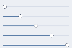
A slider at five values. The thumb is placed by flex ratio, not by a transform.
slider
A slider is a thumb on a track whose position is a number between min and
max.
column {
  slider min=0 max=100 step=5 ticks=5 format="%.0f%%" bind="audio.gain" change="audio.set-gain"
  slider class="vertical" scale="db" max=1 format="%.2f" bind="audio.gain" change="audio.set-gain" commit="audio.seek"
  slider min=0 max=100 value=70 disabled=#true
}
import dev.goldberry.widgets.controls.slider.Slider;
import dev.goldberry.widgets.controls.Scale;

new Column(
        Slider.of(0, 100, 5, Models.observable(audio, "audio.gain"), actions::setGain)
            .ticks(5)
            .format("%.0f%%"),
        Slider.of(0, 1, 0, Models.observable(audio, "audio.gain"), actions::setGain)
            .scale(Scale.decibels())
            .format("%.2f")
            .onCommit(actions::seek)
            .styled("vertical"),
        new Slider(0, 100, 70, 0, null).disabled(true)
);
The control snaps and clamps so no application has to. Steps count from min,
an arrow offers the next reachable value, and both ends are always reachable
even when the range is not a whole number of steps.
format= is a String.format pattern over a double, checked when the slider
is built. format="%d" is refused at inflation rather than on the first frame
with a value to draw.
scale="db" places a linear gain at a position that is linear in decibels,
with the floor at −60 dB. Half gain sits 90% of the way up and the bottom of
the travel is silence exactly
(ADR-0080). It needs
min >= 0 and max > 0.
commit= is told the settled value when a press or drag is released and after
each key step, for work that should not run per drag step, such as a media
seek (ADR-0464). In Java,
spans(List<Slider.Span>) marks stretches of the range in the groove, such as
a seek bar’s buffered ranges
(ADR-0466). A document
cannot write them.
Attributes
| Attribute | Type | Default | What it does |
|---|---|---|---|
min | number | 0 | the low end |
max | number | 1 | the high end; must be above min |
value | number | min | the written value |
step | number | 0 | the grid, counted from min; 0 is continuous |
ticks | integer | 0 | tick marks along the travel, the ends included; 1 is refused |
format | pattern | none | draws a value label from this String.format pattern |
scale | linear, db | linear | how a value maps to a position |
bind | path | none | a Number to follow |
change | action name | none | told the value asked for, on every step of a drag |
commit | action name | none | told the value when the gesture ends |
disabled | boolean | #false | out of the Tab order, no gesture |
class, id, tooltip, context-menu, name | as on every widget |
Styling
- CSS type
slider. The classverticalmakes it a fader. - Parts:
slider-track,slider-groove,slider-fill,slider-rest,slider-span,slider-thumb,slider-ticks,slider-tick,slider-value. - Pseudo-classes:
:hoverand:activeonslider-thumb;:focus-visibleand:disabledon the control.
The thumb lands f of the way along the track because slider-fill grows by
f and slider-rest by 1 - f. Nothing in Java learns the track’s width
(ADR-0079). The value
is measured along slider-track and not along the control, which is what
keeps a labelled slider honest at its far end.
Track 4, thumb 16 with a full radius and a 1 px edge, a hit target of at least 32 across. The ticks sit in a row of height 0 so two sliders in one list, one with a scale and one without, sit at the same height.
Keyboard
| Key | Does |
|---|---|
Tab | reaches it, unless disabled |
Left, Down | one step down |
Right, Up | one step up |
PgDn, PgUp | ten steps, or a tenth of the range when step is 0 |
Home, End | min, max |
Every key step raises change and then commit. A key with a modifier is
left alone.
Read more
- ADR-0079: a continuous value is placed by ratio
- ADR-0080: a value is measured along a part
- ADR-0430: a slider maps the pointer over its travel
- ADR-0464: a slider says when a gesture ends
- ADR-0466: a slider marks spans of its range
knob
A knob is a rotary control: a dial with a pointer, an arc that fills as the
value rises, and a vertical drag as its gesture.
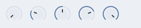
A knob at five values. The arc runs 270 degrees from the lower left.
row {
  knob min=0 max=100 step=5 detents=5 bind="audio.gain" change="audio.set-gain"
  knob class="large" drag="circular" bind="audio.pan" change="audio.set-pan"
}
import dev.goldberry.widgets.controls.knob.Knob;

new Row(
        Knob.of(0, 100, 5, Models.observable(audio, "audio.gain"), actions::setGain).detents(5),
        Knob.of(0, 1, 0, Models.observable(audio, "audio.pan"), actions::setPan)
            .circular(true)
            .styled("large")
);
Dragging up turns it up: 200 px of drag is the whole range, and Shift makes
the drag ten times finer. The gesture is a rate from where the press started,
so the value does not jump to the pointer
(ADR-0089). A click on the ring
positions the value at that angle. A click on the dial grabs it and does not
jump. The wheel steps it, down the document is down.
drag="circular" turns the knob round its dial instead, following the angle
of the pointer, and refuses to jump across the gap at the bottom
(ADR-0369).
Detents are positions the value is pulled to when a drag comes within a quarter of their spacing. Five detents over 0 to 100 are 0, 25, 50, 75 and 100.
Attributes
| Attribute | Type | Default | What it does |
|---|---|---|---|
min | number | 0 | the low end |
max | number | 1 | the high end; must be above min |
value | number | min | the written value |
step | number | 0 | the grid; 0 is continuous |
detents | integer | 0 | positions a drag is pulled to, the ends included; 1 is refused |
drag | circular | none | turn round the dial instead of up and down |
bind | path | none | a Number to follow |
change | action name | none | told the value asked for |
disabled | boolean | #false | out of the Tab order, no gesture |
class, id, tooltip, context-menu, name | as on every widget |
There is no commit= on a knob.
Styling
- CSS type
knob. The classlargemakes it 48 instead of 32. - Parts:
knob-track, the full arc in the muted ink;knob-arc, the filled part;knob-dial, the disc with the pointer. - Pseudo-classes:
:hoverand:activeonknob-dial;:focus-visibleand:disabledon the control.
The arc is 270 degrees starting at 7:30. The dial is inset 5 from the ring and
the pointer is a 2 px stroke in the dial’s own colour token. The arc and the
pointer are strokes, so they take color like every other mark.
Keyboard
| Key | Does |
|---|---|
Tab | reaches it, unless disabled |
Left, Down | one step down |
Right, Up | one step up |
PgDn, PgUp | ten steps, or a tenth of the range when step is 0 |
Home, End | min, max |
The keys are always consumed, even at an end, so a knob at its maximum still
owns Right and focus does not leave it.
Read more
- ADR-0089: a knob’s gesture is a rate
- ADR-0369: a knob turns round its dial from its own value
- ADR-0078: a focus scope has an axis
progress
A progress bar reports a value out of a maximum, or that something is
happening and nobody can say how much is left.
column {
  progress value=0.4
  progress max=100 bind="download.received"
  progress indeterminate=#true
}
import dev.goldberry.widgets.controls.progressbar.Progress;

new Column(
        new Progress(0.4),
        Progress.of(100, Models.observable(download, "download.received")),
        Progress.sweeping()
);
A determinate bar’s fill is a plain width, the value divided by max and
clamped to the track. An indeterminate bar sweeps by a transform, turns at
the ends rather than running off them, and keeps the frame loop awake while it
is on screen. Two indeterminate bars in one window are in step by
construction, because the phase is read from the clock and nothing is stored
(ADR-0081).
Attributes
| Attribute | Type | Default | What it does |
|---|---|---|---|
value | number | 0 | the written value |
max | number | 1 | what a full bar is; must be positive |
indeterminate | boolean | #false | sweep instead of fill |
bind | path | none | a Number to follow |
class, id, tooltip, context-menu, name | as on every widget |
Styling
- CSS type
progress. - Parts:
progress-fill. - Pseudo-classes:
:indeterminate.
progress-fill                        { background: var(--gb-progress-fill-bg) }
progress:indeterminate progress-fill { background: var(--gb-accent) }
Track height 4, full radius, overflow: hidden on the track so the sweep is
cut at both edges (ADR-0418).
A value change moves the fill’s width instantly and transitions its colour,
because width is not on the motion whitelist. Under reduced motion the sweep
holds still at a third of the track.
Keyboard
None. A progress bar takes nothing back.
Read more
spinner
A spinner is a ring that turns, for a wait with no measure.
row {
  spinner size="small"
  spinner
  spinner size="large"
}
import dev.goldberry.widgets.controls.spinner.Spinner;
import dev.goldberry.widgets.controls.spinner.SpinnerSize;

new Row(
        new Spinner(SpinnerSize.SMALL),
        new Spinner(),
        new Spinner(SpinnerSize.LARGE)
);
Small sits beside a line of text or inside a busy control, medium is the default, and large stands on its own for a region that is not ready. A full turn takes 900 ms and the phase is the clock’s, so every spinner in a window turns together.
Attributes
| Attribute | Type | Default | What it does |
|---|---|---|---|
size | small, medium, large | medium | 12, 16 or 32 px; another word is refused |
class, id, tooltip, context-menu, name | as on every widget |
Styling
- CSS type
spinner. - No parts. The ring is a mark the widget paints.
- No pseudo-classes.
- Classes:
small,medium,large, which the size puts on the node.
The diameter is the stylesheet’s and the stroke is the widget’s. size= puts
a class on the node, controls.css gives that class a width, and the widget
weights the stroke from the width the cascade resolved, so #busy { width: 48px } gets a stroke to match
(ADR-0447).
The ring takes color. Under reduced motion it stops.
Keyboard
None.