Choices
A tick, a switch, one of several, and one or more from a list.
By the end of this chapter you can bind a checkbox or a switch to a boolean,
offer a choice as radios, a segmented bar or a dropdown, and let a user pick
several values from one select.
Every control here is controlled. Clicking a checkbox does not move the tick.
It raises change, the application sets the value, and the tick moves when the
bound value does. A control that will not move means the state did not change,
which is where the bug is
(ADR-0063).

A checkbox in its three states. Mixed matches :indeterminate, not :checked.
checkbox
A checkbox is a tick with a label, in two states or three.
column {
  checkbox bind="prefs.frost" change="prefs.toggle-frost" "Frosted sidebar"
  checkbox checked=#true disabled=#true "Sworn to the Fellowship"
  checkbox indeterminate=#true "Some of them"
}
import dev.goldberry.widgets.controls.checkbox.Checkbox;

new Column(
        Checkbox.of("Frosted sidebar", Models.observable(prefs, "prefs.frost"), actions::toggleFrost),
        new Checkbox("Sworn to the Fellowship", Checkbox.Value.CHECKED).disabled(true),
        new Checkbox("Some of them", Checkbox.Value.MIXED)
);
MIXED is a real state. A select-all over a partial selection is neither on
nor off, so it matches :indeterminate rather than :checked. Toggling never
produces it: clicking a mixed box asks for all of them. Only the application
can put a box there.
The bound value may be a Boolean or a Checkbox.Value. Anything else leaves
the written state standing.
Attributes
| Attribute | Type | Default | What it does |
|---|---|---|---|
| argument | string | "" | the label, which is part of the click target |
checked | boolean | #false | the written state |
indeterminate | boolean | #false | the mixed state; wins over checked |
bind | path | none | the value to follow; wins over the written state |
change | action name | none | raised on every toggle; it says that, not what |
disabled | boolean | #false | refuses the toggle and leaves the Tab order |
class, id, tooltip, context-menu, name | as on every widget |
Styling
- CSS type
checkbox. - Parts:
check-indicator, the 16 px glyph, andcheck-mark, the tick inside it. - Pseudo-classes:
:checkedand:indeterminateon the control and oncheck-indicator;:hover,:active,:focus-visible,:disabled.
check-indicator:checked { background: var(--gb-accent) }
The glyph is a part, which is a CSS type that is not a node a document can
write (ADR-0065).
The mark exists in every state at opacity: 0 so that it can scale in when
checked. Every control and part declares flex-shrink: 0. The label does not,
so a cramped row ellipses the text and never squashes the glyph
(ADR-0076).
The hit target is at least 32 square and the label gap is 8.
Keyboard
| Key | Does |
|---|---|
Tab | reaches it, unless disabled |
Space | toggles it |
Enter deliberately does nothing. It belongs to a dialog’s default action, and
a checkbox that swallowed it would leave a form with no keyboard route to
submit.
Read more
- ADR-0065: a part is styleable and not constructible
- ADR-0063: data flows down, events flow up
- ADR-0076: a glyph does not negotiate
toggle
A toggle is a switch: a pill with a disc that slides, and the one control
that acts on a release.
column {
  toggle bind="prefs.frost" change="prefs.set-frost" "Frosted sidebar"
  toggle on=#true disabled=#true "Bound by oath"
}
import dev.goldberry.widgets.controls.toggle.Toggle;

new Column(
        Toggle.of("Frosted sidebar", Models.observable(prefs, "prefs.frost"), actions::setFrost),
        new Toggle("Bound by oath", true).disabled(true)
);
change carries the state asked for, as a boolean, not “the other one”. A drag
of 8 px or more asks for the direction dragged, so dragging right on a switch
that is already on asks for on. A shorter drag is a click and flips it. The
8 is half of the thumb’s 16 px travel
(ADR-0075).
Attributes
| Attribute | Type | Default | What it does |
|---|---|---|---|
| argument | string | "" | the label |
on | boolean | #false | the written state |
bind | path | none | a boolean to follow; wins over on |
change | action name | none | told the state asked for, as "true" or "false" |
disabled | boolean | #false | refuses the gesture and leaves the Tab order |
class, id, tooltip, context-menu, name | as on every widget |
In Java the handler is a Consumer<Boolean>. From markup the action receives
the string, so an @Action method takes a boolean.
Styling
- CSS type
toggle. - Parts:
toggle-track, the 36 by 20 pill, andtoggle-thumb, the 16 px disc. - Pseudo-classes:
:checkedon the control and ontoggle-track;:hover,:active,:focus-visible,:disabled.
toggle-track:checked toggle-thumb { transform: translate(16px) }
Where the thumb travels to is the stylesheet’s decision. The track’s padding is
2 because 2 + 16 + 16 + 2 = 36 is what makes the travel 16.
Keyboard
| Key | Does |
|---|---|
Tab | reaches it, unless disabled |
Space | flips it |
Read more
radio
A radio is one option in a group. It carries a value and a label, and the
group decides whether it is on.
radio-group value="dark" {
  radio value="dark" "Moria"
  radio value="light" "Lothlórien"
  radio value="system" disabled=#true "Follow the system"
}
import dev.goldberry.widgets.controls.radio.Radio;
import dev.goldberry.widgets.controls.radio.RadioGroup;

new RadioGroup("dark",
        new Radio("dark", "Moria"),
        new Radio("light", "Lothlórien"),
        new Radio("system", "Follow the system").disabled(true));
selected is deliberately not an attribute. A document that could mark one
option selected could mark two, so the group rewrites each option with whether
its value matches on every build.
Attributes
| Attribute | Type | Default | What it does |
|---|---|---|---|
value | string | required | what the group reports and matches on; an empty one is refused |
| argument | string | "" | the label |
disabled | boolean | #false | this option only; a disabled group fades once, not per option |
class, id, tooltip, context-menu, name | as on every widget |
The option’s key is its value, so a group whose options are filtered or reordered keeps each option’s element and the focus on it.
Styling
- CSS type
radio. - Parts:
radio-indicator, a 16 px ring, andradio-dotinside it. - Pseudo-classes:
:checkedon the control and onradio-indicator;:hover,:active,:focus-visible,:disabled.
Keyboard
| Key | Does |
|---|---|
Space | selects it |
The arrows are the group’s. See below.
Read more
radio-group
A radio-group holds the fact that exactly one of its options is on.
radio-group bind="prefs.theme" change="prefs.pick-theme" {
  radio value="dark" "Moria"
  radio value="light" "Lothlórien"
  text class="caption" "The switch in the title bar moves these too"
}
RadioGroup.of(Models.observable(prefs, "prefs.theme"), actions::pickTheme,
        new Radio("dark", "Moria"),
        new Radio("light", "Lothlórien"));
A value no option carries selects nothing, which is right for a model that has
not loaded. A child that is not a radio, a caption or a separator, is left
exactly where it was written.
change has to say which one, so it is the first action in the toolkit that
takes an argument. In Java the handler is a Consumer<String>. From markup, an
@Action method with one String parameter receives the value, and a plain
Runnable still resolves for a handler that reads the model itself.
Attributes
| Attribute | Type | Default | What it does |
|---|---|---|---|
value | string | none | the written selection |
bind | path | none | the value to follow; wins over value |
change | action name | none | told the value of the option asked for |
disabled | boolean | #false | the whole group, out of the Tab order |
class, id, tooltip, context-menu, name | as on every widget |
The children are the options.
Styling
- CSS type
radio-group. It is a column incontrols.css; the classinlinemakes it a row. - No parts of its own. The options are
radionodes. - Pseudo-classes:
:disabled.
The widget names the semantics and the stylesheet names the axis, which is why the direction is a class and not an attribute.
Keyboard
| Key | Does |
|---|---|
Tab | enters the group at the selected option, or leaves it |
Left, Up | move to the previous option and select it |
Right, Down | move to the next option and select it |
Space | selects the focused option |
The group is one Tab stop and the arrows rove inside it. The entry point is
derived from :checked rather than remembered, so the selection is the roving
position and the two cannot disagree
(ADR-0073). Selection follows
focus the controlled way: an arrow raises change and does not move the dot.
Read more
- ADR-0073: a composite is one Tab stop
- ADR-0078: a focus scope has an axis
- ADR-0063: data flows down, events flow up
segmented
A segmented control is a radio group drawn as one bar, with the arrows on its
own axis.
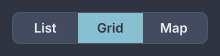
A segmented bar. Each segment is exactly a third of it.
segmented bind="view.mode" change="view.set-mode" {
  option value="list" "List"
  option value="grid" "Grid"
  option value="map" icon="map" "Map"
}
import dev.goldberry.widgets.controls.segmented.Segmented;
import dev.goldberry.widgets.controls.option.Option;

Segmented.of(Models.observable(view, "view.mode"), actions::setMode,
        new Option("list", "List"),
        new Option("grid", "Grid"),
        new Option("map", "Map").withIcon(map));
An icon-only segment is option value="map" icon="map" name="Map". In a
document that is only as real as its icon registry: with no icon bound to
map, the option has neither a label nor an icon and is refused.
It shares radio-group’s model exactly: one Tab stop, exactly one selected,
change reports the value. It is a separate widget because the two are not
substitutable in a layout. A bar belongs in a toolbar and a group belongs in a
form.
Attributes
| Attribute | Type | Default | What it does |
|---|---|---|---|
value | string | none | the written selection |
bind | path | none | the value to follow; wins over value |
change | action name | none | told the value of the segment asked for |
disabled | boolean | #false | the whole bar |
class, id, tooltip, context-menu, name | as on every widget |
The children are option nodes.
Styling
- CSS type
segmented. - Parts:
segmented-track,segmented-indicator, which travels under the selected segment and matches:checked, andsegmented-divider, which takes the classbeside-selectionon the two hairlines that fade out. - The segments are
optionnodes with:checked,:hover,:active,:focus-visibleand:disabled. - Pseudo-classes on the bar:
:disabled.
Height 32, segment padding 12, radius 8 on the outer corners and 0 between,
in body-strong. Segments are equal, each exactly 1/n of the bar, so the
indicator travels by a percentage and the bar takes the width it is given
(ADR-0217). A label
that does not fit its segment is cut with an ellipsis.
Keyboard
| Key | Does |
|---|---|
Tab | enters the bar at the selected segment |
Left, Right | move and select |
Space | selects the focused segment |
Up and Down stay with whatever is above and below, because a bar has an
axis of its own (ADR-0078).
Read more
- ADR-0217: a segmented control is joined again
- ADR-0097: a selection that travels needs a geometry
- ADR-0099: an indicator travels on a grid
- ADR-0078: a focus scope has an axis
select
A select is a closed control and a list that opens in a window of its own,
so it is never clipped by the card it sits in.
column {
  select bind="prefs.theme" change="prefs.pick-theme" placeholder="Choose a light" {
    option value="dark" "Moria"
    option value="light" "Lothlórien"
  }
  select multiple=#true bind="prefs.tongues" change="prefs.toggle-tongue" {
    option value="sindarin" "Sindarin"
    option value="quenya" "Quenya"
    option value="westron" "Westron"
  }
  select autocomplete=#true free=#true query="places.search" options="places.matches" \
         bind="places.chosen" change="places.choose" placeholder="Anywhere in the West"
}
import dev.goldberry.widgets.controls.select.Select;

Select.of(Models.observable(prefs, "prefs.theme"), actions::pickTheme,
        new Option("dark", "Moria"),
        new Option("light", "Lothlórien"))
    .placeholder("Choose a light");

Select.of(Models.observable(prefs, "prefs.tongues"), actions::toggleTongue, tongues)
    .multiple(true);

new Select(place, actions::choose, matches.toArray(Option[]::new))
    .autocomplete(actions::search)
    .free(true);
The closed control shows the selected option’s label, or the placeholder. It is as wide as its widest option, so it does not change width as the value does (ADR-0359).
multiple=#true makes the selection a set. The bound value is a
Collection, each chosen value is drawn as a chip inside the closed control
with a ×, and change is a toggle: asking for a value the set already holds
takes it out. The list stays open while values are picked
(ADR-0182).
autocomplete=#true puts a real text-input in the closed control. Typing
raises query with the text, the application answers by supplying new
options, and the list narrows. The filtering is the application’s, so a
remote-backed combobox is the same widget with a slower model. A free-typed
value is refused unless free=#true
(ADR-0183). In
markup, options= names a bound list of Option values that replaces the
written ones each time it changes
(ADR-0367).
A tree is Java only. select.tree(roots) takes a list of TreeNode and
opens a tree instead of a flat list, leaf-only by default. A tree’s model is
nodes with suppliers under them, which a document has no way to write
(ADR-0184).
Attributes
| Attribute | Type | Default | What it does |
|---|---|---|---|
value | string | none | the written selection |
bind | path | none | the value to follow; a Collection when multiple |
change | action name | none | told the value chosen, or toggled when multiple |
placeholder | string | "" | shown when nothing is selected |
multiple | boolean | #false | the selection is a set drawn as chips |
autocomplete | boolean | #false | the closed control is a field you type in |
free | boolean | #false | a typed value that matches no option is accepted |
query | action name | none | told the typed text, when autocomplete |
options | path | none | a bound List<Option> that replaces the written options |
disabled | boolean | #false | the whole control |
class, id, tooltip, context-menu, name | as on every widget |
The children are option nodes. Anything else is left where it was written.
Styling
- CSS type
select. - Parts:
select-value, which takes the classplaceholderwhen standing in for a value;select-chevron;select-chipsandselect-chipwithselect-chip-labelandselect-chip-remove, whenmultiple;select-list, the popup, holdingoptionrows; andselect text-input, the field, whenautocomplete. - Pseudo-classes:
:hover,:focus-visible,:disabled. - Classes:
openwhile the list is up, andmultiple.
The closed control is a well like text-input, height 32, padding 8, radius
4, in body. In the list a row is a list row’s height and its label is
body, the chosen row takes --gb-selection, and the row the keyboard is on
takes :focus-visible.
Keyboard
| Key | Does |
|---|---|
Tab | reaches the closed control |
Space | opens the list, unless autocomplete, where it types a space |
Down, Up, Alt+Down | open the list |
Down, Up in the list | move the focus between rows |
Enter | chooses the focused row |
Esc | closes the list; with autocomplete, restores the last committed value |
Arrows move and Enter chooses, which is the opposite of a segmented bar’s
roving selection. The shared option record carries which of the two it is in.
Typing on the closed control is typeahead over the labels.
Read more
- ADR-0141: a select is a closed control and a list
- ADR-0182: a select may hold more than one
- ADR-0183: a combobox is a select you can type in
- ADR-0184: a tree is a list that remembers what is open
- ADR-0359: a select is as wide as its widest option
- ADR-0367: a document places a list it cannot describe
- ADR-0185: a list that hangs off a field does not take the keyboard
option
An option is one choice, in a segmented bar or a select list. It carries
a value and a label, an icon, or both.
select value="grid" {
  option value="list" "List"
  option value="grid" icon="grid" "Grid"
  option value="map" disabled=#true "Map"
}
new Select("grid", actions::setMode,
        new Option("list", "List"),
        new Option("grid", "Grid").withIcon(grid),
        new Option("map", "Map").disabled(true));
Whether it is selected and what selecting it does are its container’s, set on
every build. new Option("list") uses the value as the label.
Attributes
| Attribute | Type | Default | What it does |
|---|---|---|---|
value | string | required | what the container reports and matches on |
| argument | string | "" | the label; an option needs a label or an icon |
icon | icon name | none | an icon before the label |
disabled | boolean | #false | this option only |
name | string | none | the accessible name an icon-only option needs |
class, id, tooltip, context-menu | as on every widget |
Styling
- CSS type
option. - No parts.
- Pseudo-classes:
:checked,:hover,:active,:focus-visible,:disabled.
A label that does not fit is cut with an ellipsis rather than wrapped (ADR-0255).
Keyboard
Space selects it in a bar. Space or Enter chooses it in a list. The
arrows are the container’s.