Text and links
A run of text that wraps where layout puts it, and a word that goes somewhere when pressed.
By the end of this chapter you can put a label on screen at any rank of the type scale, bind it to a value, and make a word open a screen or a web page.
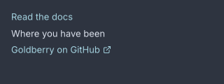
Three link widgets: plain, visited, and external.
text
A text is one run of text. It wraps at the width layout gives it and nothing
else about it is decided in Java.
column {
  text style="title" "The Red Book"
  text class="caption" "Marked in a hand that was not steady"
  text bind="app.status" "checking…"
}
import dev.goldberry.widgets.text.Text;
import dev.goldberry.widgets.text.TextRank;

new Column(
        new Text("The Red Book").style(TextRank.TITLE),
        new Text("Marked in a hand that was not steady").styled("caption"),
        Text.of("checking…", Models.observable(app, "app.status"))
);
The argument is what the text says. With bind=, the argument is the fallback
shown until the bound value answers, and a null value draws as nothing rather
than as the word null. The value is read at render, so a change that lands
between a build and a frame is in that frame.
Attributes
| Attribute | Type | Default | What it does |
|---|---|---|---|
| argument | string | "" | the text, or the fallback when bind= is set |
bind | path | none | the value to follow, read-only |
style | rank name | none | one of the seven ranks below, added as a class; a name that is not one is refused |
class | string | none | CSS classes, space-separated |
id | string | none | the node’s id, which is also its reconciliation key |
tooltip | string | none | text shown on hover |
context-menu | string | none | the name of a menu a right-click opens |
name | string | none | the accessible name |
style= and class= are two spellings of one thing. text style="title" and
text class="title" both put the class title on the node, and a rule written
text.title matches either. The difference is that style= is checked when the
document inflates (ADR-0381).
The type scale
The ranks are classes in controls.css. They inherit, so a class on a container
reaches every label under it.
| Class | Face | Size / line |
|---|---|---|
display | Inter 600 | 28 / 34 |
title | Inter 600 | 20 / 26 |
heading | Inter 600 | 15 / 20 |
body | Inter 400 | 13 / 18 |
body-strong | Inter 600 | 13 / 18 |
caption | Inter 400 | 11 / 14 |
mono | JetBrains Mono 400 | 13 / 18 |
The sizes are the theme’s tokens, --gb-font-title and so on, so a large-text
theme moves every rank at once. The showcase’s rank-display and card-title
classes are its own stylesheet’s and not the toolkit’s.
Wrapping and cutting
A text is a measured leaf: layout proposes a width, the paragraph wraps at it,
and the height that comes back sizes the box. The paragraph is shaped once and
re-wrapped by arithmetic
(ADR-0036).
To keep a label on one line, the stylesheet says so:
text.name { white-space: nowrap; text-overflow: ellipsis }
nowrap stops the wrap and ellipsis marks the cut
(ADR-0255).
text-align places the lines inside the box.
Static text cannot be selected or copied. A text-input with
read-only=#true shows text a user can select, in
Fields and forms.
Inline runs are not built. There is no span node, so a sentence with two
styles is two text nodes in a row.
An emoji in a line is routed to the colour face and drawn in layers, and the face is a module an application opts into. See Text and ADR-0393.
Styling
- CSS type
text. - No parts.
- No pseudo-classes of its own. It is not focusable and takes no hover.
- Classes: the seven ranks above, and whatever the document writes.
A text sets no colour. color inherits from the nearest ancestor that sets
one, which is a card, a panel or the window
(ADR-0066).
Keyboard
None. A text is not a Tab stop.
Read more
- ADR-0381: a rank has two spellings and one meaning
- ADR-0062: bind is a path and nothing else
- ADR-0036: the paragraph is shaped once and wrapped many times
- ADR-0255: a label that does not fit is cut, not wrapped
- ADR-0267: a text scale scales the text and not the layout
link
A link is a word that does something: it runs an action, opens a URL through
the desktop, or both.
column {
  link action="app.show-docs" "Read the docs"
  link href="https://goldberry.dev" "Goldberry on the web"
  link href="mailto:hello@example.org" visited=#true "Write to us"
}
import dev.goldberry.widgets.text.Link;

new Column(
        new Link("Read the docs", actions::showDocs),
        Link.external("Goldberry on the web", "https://goldberry.dev"),
        Link.external("Write to us", "mailto:hello@example.org").visited(true)
);
action= is in-app navigation. href= is handed to the desktop’s own handler
for its scheme through Host.openExternal, and the link logs a warning when
the platform refuses it. A link with both runs the action and then opens the
target. A link with neither is a word in the link ink that takes no focus.
An external link draws the toolkit’s 12 px external-link icon after the word.
That icon is the one icon the toolkit builds itself, and the link’s state owns
it (ADR-0346).
Attributes
| Attribute | Type | Default | What it does |
|---|---|---|---|
| argument | string | required | the word; an empty label is refused |
action | action name | none | what an in-app link runs |
href | string | none | what an external link opens |
visited | boolean | #false | adds the visited class; the toolkit keeps no history, so this is the application’s to set |
class, id, tooltip, context-menu, name | as on every widget |
Styling
- CSS type
link. The record builds a node of this type. There are no parts. - Pseudo-classes:
:hoverunderlines,:focus-visibletakes the standard ring. - Classes:
visitedtakes--gb-text-muted;externalis set whenhref=is present.
The underline is text-decoration: underline in controls.css, drawn at the
face’s own position and thickness
(ADR-0321). The ink is
--gb-button-link-text, a token measured for 4.5:1 on every surface, and not
the accent.
A link is block-level: a row of a word and sometimes an icon, on a line of its
own. It is not button.link, which is a button that reads as text and sits in a
toolbar. See Buttons, badges and chips.
Keyboard
| Key | Does |
|---|---|
Tab | reaches it, when it has an action or an href |
Enter | follows it |
Space does not activate a link, which is every browser’s rule. A link with
nothing behind it is not a Tab stop.