Overlays
What opens over the window: a modal dialog, a floating panel, a banner in the layout, a frame-rate readout, toasts, a guided tour, and tooltips on any widget.
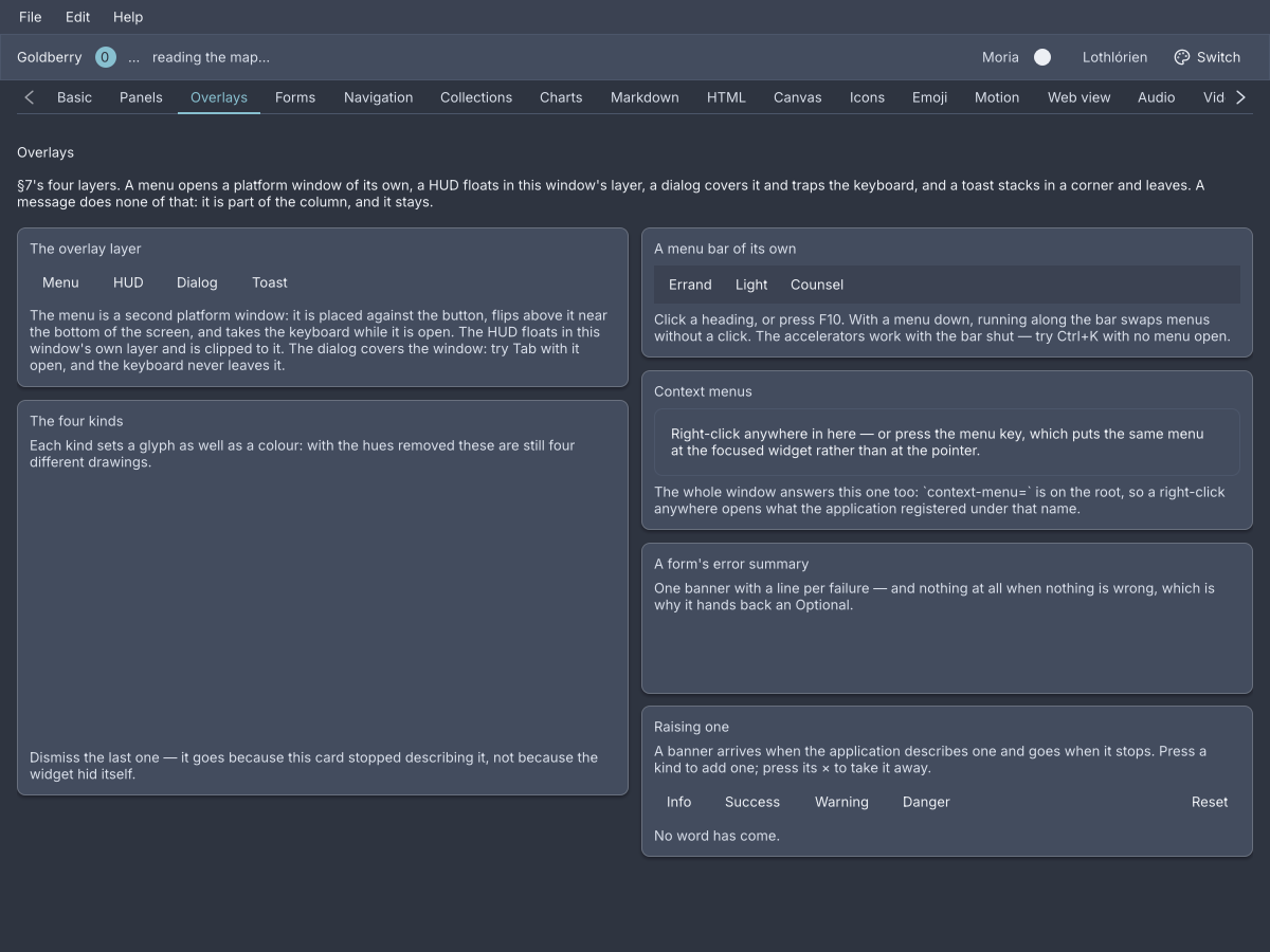
The Overlays screen of the showcase, Nord dark.
There are two places something can go over a window, and every overlay uses one of them.
The overlay layer is part of the window’s own tree. Every window is rooted
at a WindowRoot, and an overlay is one of its children beside the
application’s, so it is painted by the same frame and clipped to the window
(ADR-0100).
host.overlay(widget, corner) puts a widget in a corner and host.fill(widget)
covers the window. Both return an Overlay whose remove() takes it away.
A dialog, a HUD, a toast stack and a tour live here.
A platform popup is a second window the platform draws, parented to this
one and free of its bounds
(ADR-0103).
host.popup(content, anchorId, placement) measures the content, places it
against the node with that id, flips it when it would leave the screen, and
opens it (ADR-0104). The
answer is an Optional<Popup>, and empty is an ordinary answer: the video
driver may have no popup windows, or nothing with that id has been painted yet
(ADR-0102). A
menu, a select’s list and a tooltip live here.
host.popup(new Popover(new Text("Saved.")), "save-button", Placement.BELOW)
    .ifPresent(open -> this.hint = open);
Placement.BELOW, ABOVE and AFTER are the three sides, .align(Align)
chooses START, CENTER or END along the anchor, and .gap(float) the
distance. A popup is light-dismissed by default: a press in the owner window
or Escape closes it, and popup.close() does from Java.
dialog
A modal: a veil over the window, a panel with a title and buttons, and a focus trap that keeps the keyboard inside until it is answered.
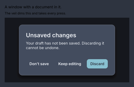
Three roles: a neutral action, the dismissive one and the affirmative one on the right.
dialog id="unsaved" title="Unsaved changes" {
  text "Your draft has not been saved. Discarding it cannot be undone."
  action role="neutral" press="app.dont-save" "Don't save"
  action role="dismissive" press="app.stay" "Keep editing"
  action role="affirmative" press="app.discard" "Discard"
}
private Overlay open;

private void askToDiscard() {
    open = Dialogs.show(host, new Dialog("Unsaved changes",
            new Text("Your draft has not been saved. Discarding it cannot be undone."),
            new DialogAction("Don't save", DialogAction.Role.NEUTRAL, this::dontSave),
            new DialogAction("Keep editing", DialogAction.Role.DISMISSIVE, this::stay),
            new DialogAction("Discard", DialogAction.Role.AFFIRMATIVE, this::discard))
        .id("unsaved"));
}

private void discard() {
    open.remove();
}
A dialog is a widget, and showing one is not: Dialogs.show(host, dialog)
fills the window with it and hands back the Overlay
(ADR-0176).
Removing it is the application’s, because only the application knows the
question was answered. Every route out fades the panel first and calls the
handler when the fade is over.
The focus trap. While a modal is mounted the focused node is inside it.
Focus lands on the first focusable thing in the panel, Tab cycles within it,
and a press on the veil counts as the dismissive action. When the overlay is
removed the keyboard goes back to the one node that had it before, with the
same keyboard-or-pointer flag it had then
(ADR-0180). The veil is
the whole of the pointer’s modality, and modality is one flag on the panel
(ADR-0232).
Attributes
| Attribute | Type | Default | What it does |
|---|---|---|---|
title | string | none | The title bar. Blank is the same as absent. |
id, class | string | The usual. Dialogs.show gives an untitled one the id dialog. |
action children become the button bar, in role order. Every other child is
the body. A dialog with two affirmative or two dismissive actions is refused,
because Enter and Escape each press exactly one button.
Styling
The CSS type is dialog, the panel, inside a dialog-scrim. Its parts are
dialog-title, dialog-body and dialog-actions. The buttons are ordinary
buttons: the affirmative one carries primary, a neutral one ghost, the
dismissive one neither. The bar puts the affirmative on the right; a theme
that wants Windows order writes dialog-actions { flex-direction: row-reverse }.
Padding 24, minimum width 320, maximum 80% of the window.
Keyboard
| Key | Does |
|---|---|
Enter | presses the affirmative action |
Escape | presses the dismissive action, as a press on the veil does |
Tab | moves within the dialog and never leaves it |
A dialog with no dismissive action cannot be dismissed by Escape or the veil.
Read more
- ADR-0176: A dialog is a widget and showing one is not
- ADR-0180: The keyboard goes back where it was
- ADR-0232: Modality is one flag and not a scrim
action
One button in a dialog’s bar, with the role that decides which key presses it.
action role="affirmative" press="app.discard" "Discard"
new DialogAction("Discard", DialogAction.Role.AFFIRMATIVE, this::discard);
Attributes
| Attribute | Type | Default | What it does |
|---|---|---|---|
| argument | string | "" | The label. |
role | "affirmative", "dismissive", "neutral" | "neutral" | Enter presses the affirmative, Escape the dismissive, nothing presses a neutral. Any other word is refused. |
press | action name | none | What the button does. |
id, class | string | The usual. Children are ignored. |
popover
An anchored floating panel: the surface a popup shows, with the opening left
to Host.popup.
popover {
  text "Saved a moment ago."
  button class="ghost" press="app.undo" "Undo"
}
var popover = new Popover(
        new Text("Saved a moment ago."),
        new Button("Undo", actions::undo).styled("ghost")
);
host.popup(popover, "save-button", Placement.BELOW)
    .ifPresent(open -> this.hint = open);
The two halves are deliberately not one widget. popover is the panel and
nothing else; where it goes, when it flips and when it goes away belong to the
popup, which serves a tooltip and a select equally
(ADR-0104).
Attributes
| Attribute | Type | Default | What it does |
|---|---|---|---|
id, class | string | The usual. Any children. |
Styling
The CSS type is popover. A popover button rule sizes buttons inside it.
There are no parts, pseudo-classes or variants.
Keyboard
None of its own. The popup it is shown in closes on Escape while light
dismiss is on.
message
An inline banner about the region it sits in: a kind, an icon, text, optional action links and an optional dismiss.
column {
  message kind="warning" "Your session ends in five minutes." {
    button class="ghost" press="app.extend" "Stay signed in"
  }
  message kind="danger" dismiss="app.clear" "Could not save: the port is in use."
  message kind="success" "Saved."
}
new Column(
        new Message(Message.Kind.WARNING, "Your session ends in five minutes.")
                .actions(new Button("Stay signed in", actions::extend).styled("ghost")),
        new Message(Message.Kind.DANGER, "Could not save: the port is in use.")
                .dismiss(actions::clear),
        new Message(Message.Kind.SUCCESS, "Saved.")
);
A message is not a toast. A toast is transient and floats over the window; a message is part of the layout and stays until the condition does. Its text can be bound, and a null or blank value renders as nothing, which is how a form’s error summary appears and goes:
message kind="danger" bind="form.error"
Message.summary(List<String>) builds one from a list of errors, or empty when
there are none.
Attributes
| Attribute | Type | Default | What it does |
|---|---|---|---|
| argument | string | "" | The text. |
kind | "info", "success", "warning", "danger" | "info" | The icon and tint. Any other word is refused. |
bind | path | none | A value to take the text from. Blank draws nothing. |
dismiss | action name | none | Adds a × that calls this. Without it there is no ×. |
id, class | string | The usual. The children are the action links. |
Styling
The CSS type is message, with the class success, warning or danger;
the base rule is the info look. Its parts are message-icon, message-body
holding the text and message-actions, and message-dismiss, which matches
:hover, :active and :focus-visible. Padding 12/16, radius 8, a 1px border
and a 4% tint of the kind’s colour.
Keyboard
The × is a Tab stop. Enter or Space on it dismisses.
hud
The frame loop, on top of the window it is running: frames per second and paint time by default, the whole breakdown on request.
hud readings="fps paint"
private Overlay hud;

private void toggleHud() {
    if (hud != null) {
        hud.remove();
        hud = null;
    } else {
        hud = host.overlay(Hud.stages(), Corner.BOTTOM_END);
    }
}
A HUD never asks for a frame. A readout that requested one so it could show a fresh number would be measuring itself (ADR-0101). It reads the window’s statistics down the render context and updates when something else paints.
Attributes
| Attribute | Type | Default | What it does |
|---|---|---|---|
readings | words | "fps paint" | Space-separated readings, or the preset stages or present. |
id, class | string | The usual. Children are ignored. |
The readings are fps, refresh, late, paint, build, style, layout,
raster, upload, acquire and submit. stages is the first eight, which
is what Hud.stages() builds. present is the GPU canvas’s set. A word that
is not one of them is refused.
Styling
The CSS type is hud. Each reading is a hud-reading carrying its name as a
class, hud-reading.paint, plus near or over when a time approaches or
passes the frame budget, and a hud-caption follows.
Read more
- ADR-0100: A window has a layer above its application
- ADR-0101: A diagnostic must not be the thing it measures
Toasts
A toast is a queue, and the stack is the widget. There is no toast node: a
Toast is a record, text with an optional action and a timeout, raised
through a controller from wherever it happens
(ADR-0177).
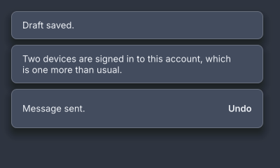
A stack of three. The newest is nearest the corner.
private final ToastController toasts = new ToastController();

@Override public void start(Host host) {
    Toasts.at(host, toasts, Corner.BOTTOM_END);
}

private void sent() {
    toasts.show(new Toast("Message sent.").action("Undo", actions::recall));
}
Toasts.at is called once. It puts one stack in the window’s corner and
returns the Overlay. After that the application holds the controller and
never mentions the stack again.
| Call | What it does |
|---|---|
new Toast(text) | A toast that stays five seconds. |
.action(label, runnable) | A button after the words. Pressing it runs the handler and starts the exit. |
.timeout(Duration) | How long it stays. Duration.ZERO never goes on its own. |
controller.show(toast), show(text) | Raises it, or queues it when three are showing. |
controller.clear() | Removes every toast. |
Toasts.of(context) | The controller from inside a widget’s build. |
Three show at once by default. A fourth waits its turn and comes forward while the oldest is still fading. The timer pauses while the pointer is on a toast and resumes from where it was. A click on the plate dismisses it. When one leaves, the older ones slide to close the hole, and at a top corner the newest is nearest the top (ADR-0178).
Styling
The stack is a toaster, with its corner as a class, toaster.bottom-end.
Each toast is a toast holding toast-text and, with an action, a
button.ghost. Width 360, padding 12/16, radius 8.
Read more
Tours
A guided sequence of stops over real widgets. The window dims except for the target, and a card beside it says what it is.
Tours.start(host, List.of(
        new Stop("demo-tabs", "A strip of your own", "Chapters that can be closed."),
        new Stop("jump-bar", "Jump to a chapter", "These bring a section into view."),
        new Stop("gallery", "The gallery strip", "Every screen, and a Ctrl+digit for the first ten.")
));
A Stop names a target by id, with a title and a body. Tours.start(host, stops) fills the window with the tour and returns the Overlay, or null
for an empty list. Tours.start(host, stops, onEnd) is told when it ends.
Each stop reads the target’s painted rectangle on every build, scrolls it into
view first, and waits for the frame before placing the card
(ADR-0121). A stop whose
target is not on screen is logged and skipped. Stop.within(ScrollController)
names the scroll to use when the enclosing one is not the right one.
Styling
The CSS type is tour. Its parts are tour-veil, four tour-bands around
the cut-out, tour-ring and tour-card, which holds texts classed
tour-title, tour-body and tour-count, and buttons classed tour-skip,
tour-back and tour-next. The card is radius 12, padding 16, at most 320
wide, and the cut-out is inset 4 with radius 8. The veil’s cut-out travels
between stops (ADR-0269).
Keyboard
| Key | Does |
|---|---|
Right | next stop |
Left | previous stop |
Escape | skips the whole tour |
Read more
- ADR-0121: A tour is a veil and a sequence
- ADR-0268: A tour card says how tall it came out
- ADR-0269: A tour arrives and its cut-out travels
Tooltips
A tooltip is an attribute, not a widget. Any node takes tooltip="…",
including one from an application’s own module, and the text rides on its
Attributes (ADR-0105).
button press="app.open-menu" tooltip="A platform popup, free of this window's bounds" "Menu"
new Button("Menu", window::openMenu).tooltip("A platform popup, free of this window's bounds");
It shows after 500 ms of hover, or when keyboard focus arrives, placed above
the node and centred, and moves between neighbours after 100 ms
(ADR-0308). The tokens
--gb-tooltip-delay and --gb-tooltip-delay-move change the two delays. It is
never focusable and never light-dismissed: it closes when the pointer leaves or
focus moves, and not on a press. Plain text only.
Styling
The plate is the CSS type tooltip: padding 8/12, radius 4, caption, at most
320 wide, on --gb-hud-bg
(ADR-0380).
Read more