Navigation
Three widgets that answer one question, where am I in a sequence: a trail of crumbs, a row of steps, and a wizard that puts steps over pages.
All three share one model. There is an ordered list, a current index, and a set of entries the application says are reachable. The widget draws the picture. The application moves the index. None of them decides on its own where the user may go next (ADR-0344).
breadcrumbs
The path to here, as a row of crumbs with a chevron between each pair. The last crumb is where you are and does not press.
breadcrumbs id="path" {
  crumb icon="home" press="app.go-home" "Home"
  crumb press="app.go-library" "Library"
  crumb press="app.go-shelf" "Reference"
  crumb "The Red Book"
}
new Breadcrumbs(
        new Crumb("Home", actions::goHome).withIcon(homeIcon),
        new Crumb("Library", actions::goLibrary),
        new Crumb("Reference", actions::goShelf),
        new Crumb("The Red Book")
).id("path");
The trail decides which crumb is current. It is always the last one written, so
a document cannot mark one and a Java caller cannot either
(ADR-0306). A trail longer
than collapse-after keeps its first crumb and its tail and folds the middle
into a … button. Pressing that button opens a menu of the hidden crumbs.
Attributes
| Attribute | Type | Default | What it does |
|---|---|---|---|
collapse-after | number | 4 | How many crumbs show before the middle folds away. 0 or less never folds. 1 and 2 are raised to 3, which is the fewest a folded trail can show. |
id, class | string | The usual. |
The constructor new Breadcrumbs(Widget... children) folds at four.
collapseAfter(int) changes it.
Styling
The CSS type is breadcrumbs. Its parts are crumb, crumb-separator and
crumb-overflow. A crumb matches :hover and :focus-visible. The current
crumb matches :checked, and that rule removes the hover wash and the pointer
cursor. There are no variant classes.
Keyboard
| Key | On | Does |
|---|---|---|
Space, Enter | a crumb with a press | presses it |
Space, Enter, Down | the … | opens the menu of hidden crumbs |
Only a crumb that has a press and is not current is a Tab stop.
Read more
crumb
One entry in a trail: a label, an optional icon, and what pressing it does.
crumb icon="home" press="app.go-home" "Home"
new Crumb("Home", actions::goHome).withIcon(homeIcon);
new Crumb("The Red Book");
Attributes
| Attribute | Type | Default | What it does |
|---|---|---|---|
| argument | string | required | The label. A crumb with no label is refused at inflation. |
icon | icon name | none | An icon before the label, from the icon registry. |
press | action name | none | What pressing the crumb does. A crumb without one is not a link. |
id, class | string | The usual. |
A crumb’s children are ignored. Whether it is current is set by the trail, not by an attribute.
steps
A row of numbered discs that says how far along a process is. On its own it is
a picture. With clickable, a reachable step can be pressed.
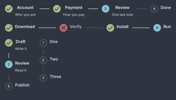
Done, current, upcoming and error, horizontal and vertical.
steps current=1 clickable=#true change="app.go-step" {
  step reachable=#true "Account" description="Who you are"
  step "Payment"
  step "Review"
}
new Steps(1,
        new Step("Account", "Who you are").reachable(true),
        new Step("Payment"),
        new Step("Review"))
    .clickable(actions::goStep);
Every step before current is done. The step at current is current. The
rest are upcoming, unless a step says error. The widget writes those four
words as classes and never decides where the user may go: clickable raises a
change with the index of a step the application marked reachable, and
refuses the rest
(ADR-0344).
Attributes
| Attribute | Type | Default | What it does |
|---|---|---|---|
current | number | 0 | The index of the current step. |
bind | path | none | A value to read the current index from instead. A bound number wins over current. |
direction | "horizontal", "vertical" | "horizontal" | Which way the row runs. |
clickable | boolean | #false | Lets a reachable step be pressed. |
change | action name | none | Called with the index of the pressed step, as a string. |
id, class | string | The usual. |
new Steps(int current, Widget... children) is horizontal and read-only.
direction(Direction), clickable(IntConsumer) and bound(Observable) set
the rest.
Styling
The CSS type is steps, with the class vertical when the direction is. A
step carries one of the classes done, current, upcoming or error, and
the current one also matches :checked. Its parts are step-marker,
step-body, step-label and step-description. Between steps sits a
step-connector holding a step-connector-fill, which scales from the step
before it when that step is done
(ADR-0356).
The marker is a 24px disc with a 2px ring: the accent when current, --gb-success
with a tick when done, --gb-danger with a cross on error, the ring alone
when upcoming.
Keyboard
| Key | On | Does |
|---|---|---|
Space, Enter | a reachable step in a clickable list | raises change with its index |
A step is a Tab stop only when the list handed it a press. The list itself takes no arrow keys.
Read more
- ADR-0344: A list of steps writes where each one stands
- ADR-0356: A connector grows from where you were
step
One step: a label, an optional description, and two flags the list reads.
step reachable=#true "Account" description="Who you are"
new Step("Account", "Who you are").reachable(true);
new Step("Verify").error(true);
Attributes
| Attribute | Type | Default | What it does |
|---|---|---|---|
| argument | string | required | The label. A step with no label is refused at inflation. |
description | string | none | A caption under the label. |
error | boolean | #false | Draws the step in --gb-danger with a cross, whatever its index. |
reachable | boolean | #false | Lets a clickable list press this step. |
id, class | string | The usual. |
A step’s state is not an attribute. step current=#true is ignored, because
the list derives it from current.
wizard
A steps indicator over one page at a time, with Back, Next and Finish under
it. It owns no validation, no policy and no data.
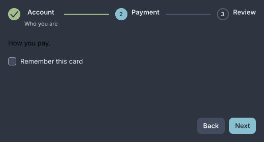
The second of three pages.
wizard id="signup" bind="signup.step" back="signup.back" next="signup.next" finish="signup.finish" {
  page "Account" description="Who you are" {
    text-input placeholder="Name"
  }
  page "Payment" {
    text "Nothing to pay."
  }
  page "Review" {
    text "All set."
  }
}
new Wizard(current,
        new WizardPage("Account", new TextInput().placeholder("Name")).describe("Who you are"),
        new WizardPage("Payment", new Text("Nothing to pay.")),
        new WizardPage("Review", new Text("All set.")))
    .onBack(() -> goTo(current - 1))
    .onNext(() -> goTo(current + 1))
    .onFinish(() -> goTo(0))
    .id("signup");
Back, Next and Finish only call their handlers. The application moves
current, by rebuilding with a new index or by setting the bound value, and a
wizard that will not advance is an application that did not move it
(ADR-0344). A
page the index has passed is done. A page marked error is drawn so in the
indicator. Only the current page’s children are built, and when the page
changes the keyboard moves into the new content.
Note
A button that has no handler is not shown. A wizard with no
back=has no Back. Next shows on every page but the last, where Finish takes its place.
Attributes
| Attribute | Type | Default | What it does |
|---|---|---|---|
current | number | 0 | The index of the page shown. Out of range is clamped. |
bind | path | none | A value to read the index from. A bound number wins over current. |
back, next, finish | action name | none | What each button does. The button exists only when its action is named. |
go-to | action name | none | Makes the indicator clickable. Called with the index of a reachable page, as a string. |
back-label, next-label, finish-label | string | "Back", "Next", "Finish" | The button labels. |
id, class | string | The usual. |
new Wizard(int current, Widget... pages) has no buttons. onBack, onNext,
onFinish and goTo add them, labels(Labels) renames them, and
bound(Observable) reads the index from a value. Children that are not a
page are ignored.
Styling
The CSS type is wizard. Its parts are the steps indicator, wizard-content
and wizard-actions. The buttons are ordinary buttons, the affirmative one
with the class primary, and Back matches :disabled on the first page. A
theme that wants Windows order writes wizard-actions { flex-direction: row-reverse }. When the wizard has an id, the buttons take <id>-back,
<id>-next and <id>-finish, and the content <id>-content. The current
page’s classes land on wizard-content.
Keyboard
The wizard takes no keys of its own. The buttons take Space and Enter, and
the indicator takes what steps takes when go-to is wired.
Read more
page
One page of a wizard: a label for the indicator, and the content shown while it is current.
page "Payment" description="How you pay" reachable=#true {
  text "Nothing to pay."
}
new WizardPage("Payment", new Text("Nothing to pay."))
    .describe("How you pay")
    .reachable(true);
Attributes
| Attribute | Type | Default | What it does |
|---|---|---|---|
| argument | string | required | The label the indicator calls it by. |
description | string | none | The caption under that label. |
error | boolean | #false | Marks the page’s step as an error. |
reachable | boolean | #false | Lets a go-to indicator press this page’s step. |
id, class | string | The classes land on wizard-content while the page is shown. |
Any children are the page’s content. A page has no CSS type of its own.